From Complex to Intuitive: A Streamlined Web Application
-
A Streamlined Navigation Experience
Scraping the traditional website look, our team opted for a “dashboard” approach to the web application. We designed out collapsable side navigation instead of the top bar nav which allowed for more features to be available to users with fewer clicks. The collapsable feature was pivotal in allowing more horizontal screen space to be created if needed by the user to see more information on the screen. The top bar was now used to promote the search function which was the top feature used by users in the old application – making it easy to begin a search.
-
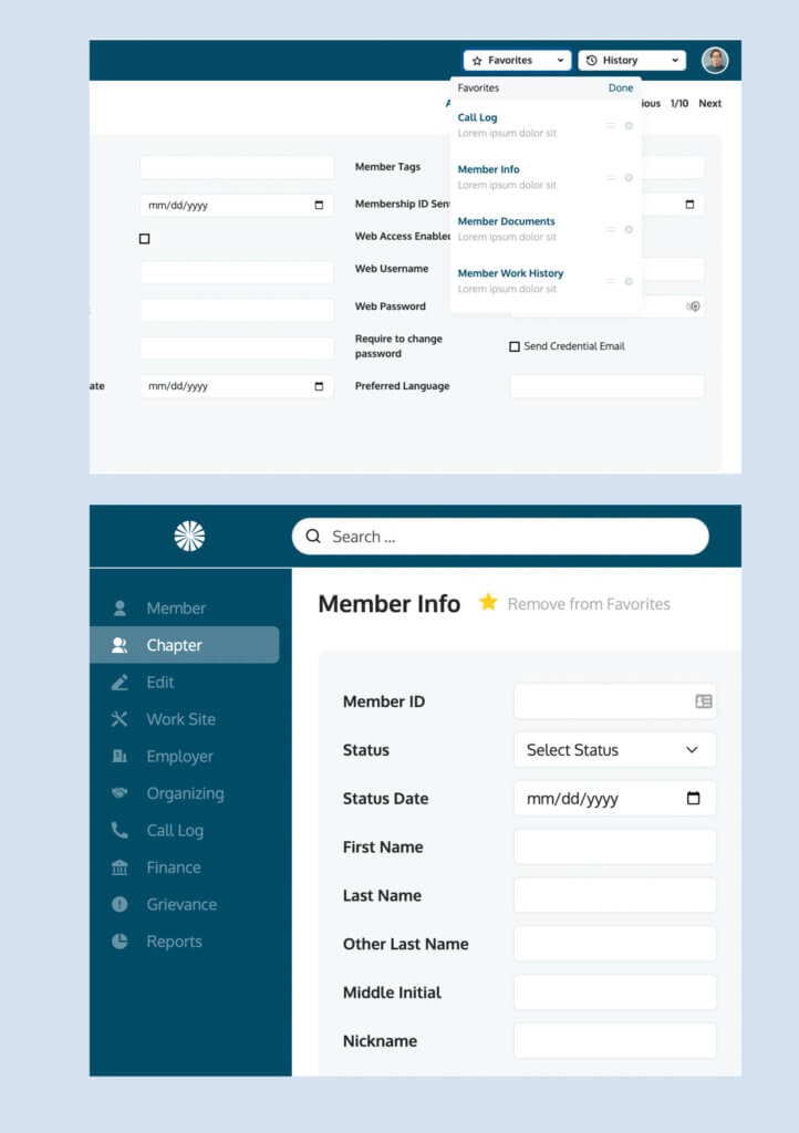
Increased Usability
Our team introduced new features based on customer feedback that would make the application easier to use, including a Favorites and History function. The favorites tab at the top right is completely customizable per user and allows them to bookmark any app functions like membership info, reports, worksite info, etc. The History function kept a record of previous pages visited by the user allowing the user to backtrack if needed.
-
A Simplified Menu System
The left side menu also gave the advantage to simplify multiple layers of navigation. In the eMembership application, it wasn’t uncommon that thee layers of navigation existed. This created a challenge in the original header menus typically used on websites. By using the left-hand menu the solution became scalable organizing sub-features in a linear way that users could understand. Secondary menu items would pop-out on the right side of main menus, while third-level sub-menu items would appear below the secondary. If it seems complicated – we get it, but as you can see the solution completely streamlined their complex navigation issues.
Improvements to Functionality, User Experience, and Mobile Viewing
-
Advanced Search & Personalization Features
Enhanced filtering tools for dental practice listings and consultants, plus geo-location functionality to tailor content (like listings, reps, events, and testimonials) based on user location.
-
User Experience Enhancements
A newly developed user dashboard differentiates logged-in experiences, giving users access to editable profiles and a more clear logged-in experience. Sales rep profile pages showcase individual reps, their listings, testimonials, and contact info.
-
Mobile Optimization & Site Organization
A mobile-first design, fixed navigation, and reorganized site structure improved both usability and speed across devices. SEO was preserved through pre-launch 301 redirects.